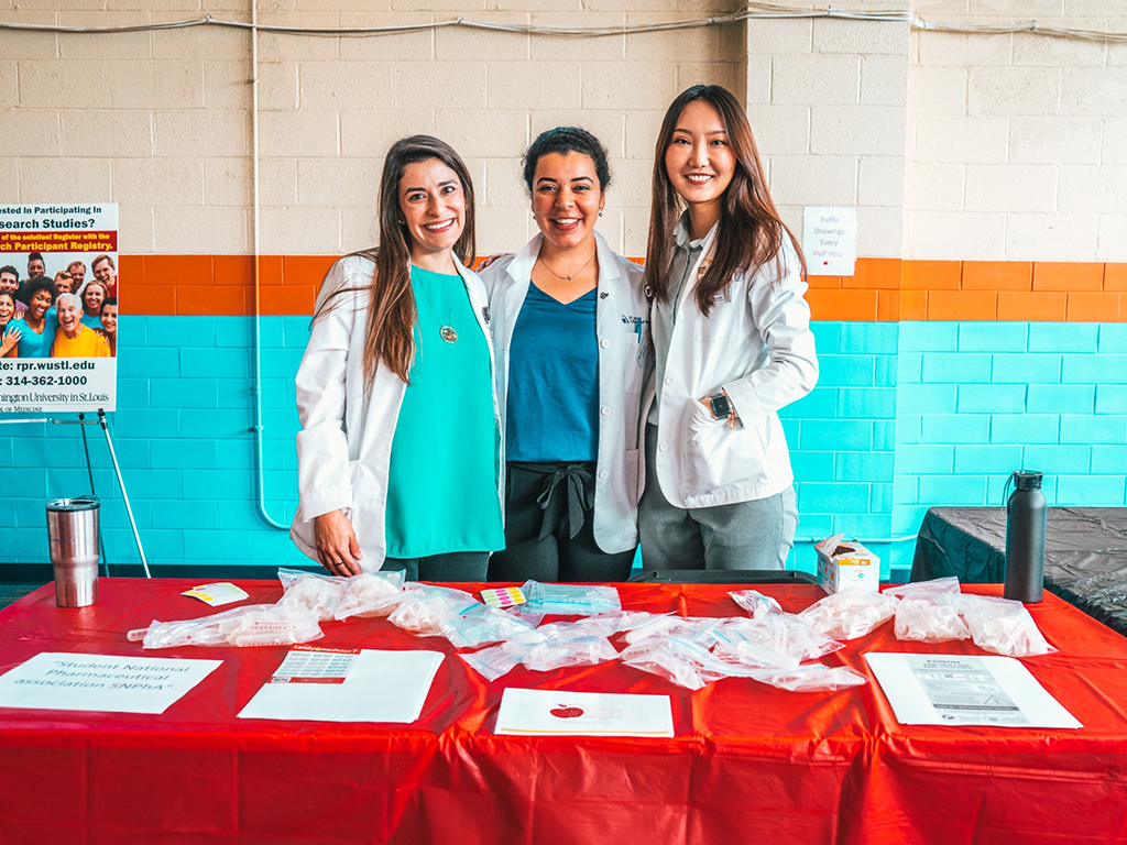
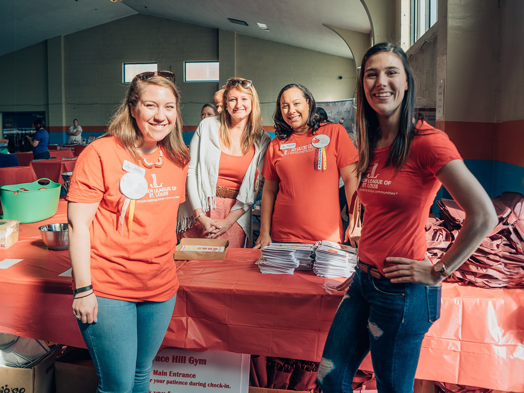
DESIGN ELEMENTS

SHOWING THE SPIRIT OF THE LEAGUE.

The look and feel of Junior League communications and materials should embody the spirit, passion, and intelligence of our organization. To achieve this, the designs should be:
[The following mirrors the tenets from the Voice section since they should both be informed by the same philosophy.]

Clear

  • We are driven by a clear vision.
  • We let our results speak for themselves.
  • We project confidence through simplicity.
  • We’re organized in our efforts.

Confident

  • We’ve been building and transforming communities for over 100 years.
  • We create significant and lasting change.
  • We’re proud of our legacy.

Bold

  • We’re not afraid to speak out to be noticed.
  • We look at issues in a new light.
  • We stand up for those who cannot.
  • We tackle the problems others ignore.
  • We believe in the power of togetherness.
While there must be consistency among the core elements, there is flexibility when creating printed and online pieces. By using the same fonts, colors and other core elements, our communications have the same ‘feel” to them—an overall Junior League style.

Text Only

Sometimes a pure typographic solution can make a more powerful statement. It’s about putting the core message front and center.

Outline

Only to be used for headlines or artwork—the design treatment provides contrast to the all cap headers and weight of the logo mark. An outline should never be used on the wordmark when it is used alone.

Tone On Tone

Give texture and depth by using monochromatic reds or greys. They should not be mixed together within the same space.

White Space

Gracious amounts of white space give design elements breathing room and helps the viewer understand what’s important.

Move Off the Page

Cropping adds visual interest. Consider cropping headers, the brand mark and images to push the boundaries of the design and move the viewer’s eye across the page. When cropping the “JL” mark, always include the full mark or the wordmark somewhere else on the page.

TYPOGRAPHY

CLARITY AND CONFIDENCE, DOWN TO THE LETTER.

DIN Typography sample

Primary Typeface

FF DIN is The Junior League’s primary typeface. This is used for the logo and wordmark, and all print communications and merchandise. FF DIN is the more polished form of it’s historical predecessor—DIN 1451. Introduced in 1905, DIN 1451 has been the standard typeface for road signage and traffic signs in Germany since the 1930s. A balanced, legible, contemporary typeface, FF DIN is celebrated for being clean, modern, bold and striking—yet neutral enough to be objective bearer of information.
DIN Numerals
DIN weights
The Junior League uses FF Din 1 and FF Din 2 families. They contain five font weights plus italic versions for each. Combine font weights in a way that visually separates different textual elements like headlines, sub-headlines, body copy, and captions. Plan carefully to create visual contrast and accentuate the content hierarchy.

Secondary Typeface

Museo Sans is The Junior League’s secondary typeface—used for the Web or for materials meant to be read online, such as PDFs. Museo is a sturdy, low-contrast, highly legible sans-serif typeface well suited for any display or text use. It includes 5 weight styles with italic versions for each. Museo should never be used as a replacement for DIN in the logo or wordmark.

Arial

Arial typeface is an acceptable stand in only when DIN or Museo are unavailable. Arial may be used in PowerPoint presentations as well. However, it should never be used as a replacement for DIN in the logo or wordmark.

COLOR

THE COLOR OF PASSION AND LEADERSHIP.

JL Red is one of our distinguishing features and is an essential part of our brand identity. When combined with white, dark grey and black, a distinct style is created that is both easy to use and powerful in its simplicity.

Usage

It is important that every JL design utilize the JL Red brand color. While it does not have to be the primary focus of the piece, it should be visible somewhere in the composition.
Use JL Red to emphasize, accentuate and lend priority. By using it in smaller increments against a white background, the color becomes more pronounced and proud. If a piece is predominantly JL Red, go with a monochromatic approach, using white type.
The logo may be placed on other background colors. In those cases, the logo should appear in white. Maintain contrast between the background and the logo to ensure legibility.
JL Red
  • #bf1e2e
  • rgb(191, 30, 46)
  • PMS 187
  • C18 M100 Y91 K8
Rich Red
  • #761213
  • rgb(118, 18, 19)
  • PMS 188
  • C27 M100 Y100 K30

  • Usage: Overlay – for monotone look, for accent in graphics
Black
  • #000000
  • rgb(0, 0, 0)
  • C0 M0 Y0 K100

Rich Black
  • C75 m68 y67 k89

  • Usage: For large solid areas
Charcoal
  • #25282a
  • rgb(37, 40, 42)
  • PMS 426
  • C0 M0 Y0 K90
Dark Grey
  • #555555
  • rgb(85, 85, 85)
  • PMS 425
  • C0 M0 Y0 K80
Medium Grey
  • #9ea1a2
  • rgb(158, 161, 162)
  • PMS 422
  • C0 M0 Y0 K50
Light Grey
  • #bcbcbc
  • rgb(188, 188, 188)
  • PMS 420
  • C0 M0 Y0 K30
Watermark
  • #ebebeb
  • rgb(235, 235, 235)
  • PMS ???
  • C0 M0 Y0 K10
JL Silver
  • PMS 877
White
  • #FFFFFF
  • rgb(255, 255, 255)
Red Gradient
  • #761213
  • to
  • #bf1e2e
Dk Red Gradient
  • #5d090a
  • to
  • #9e1f2e

PATTERN

THERE’S POWER IN NUMBERS.

Two of our patterns reference the logo block. By using the shape in a pattern, it suggests the power of our Association and the multiplying effect we have in communities. Colors can be reversed and combinations changed. For help, contact communications@ajli.org.

Step & Repeat

Dense Tonal Grid

Parallax Women

Dense Tonal Grid-Grayscale

Airy Twinkle-Grayscale

Parallax Women-Grayscale

PHOTOGRAPHY

CAPTURING LEADERSHIP AND TRANSFORMATION IN ACTION.

Used well, photography can reaffirm the spirit and point of view of The Junior League brand. Applied carelessly, it can have the opposite effect.

Subject Matter

Photography should convey the story of working in the community, helping to position The Junior League as being part of the larger fabric of society.

Quality & Resolution

Use clear, well-lit photography. Consider the composition and framing so that the image conveys a story—even to someone without context. Never use low-resolution photos or jagged/pixelated images.

Candid Images & Portraits

For community photos, photograph members engaged in the work, showing them having fun and collaborating with others. For portraits of civic leaders, etc., photograph them looking directly into camera to communicate confidence.

Avoid Misperceptions

Although photos of Junior League social activities can lend personality and texture, they should play less of a leading role. These types of images can have a reverse effect, perpetuating misperceptions of The Junior League and weakening the value of our role in our local communities and beyond. Also, when considering what photos to share please be sure to demonstrate the full spectrum of diversity that exists within your League—race/ethnicity, religion, age, personal style, appearance, etc.

General Guidelines

Signed releases should be used when adults are posed for photographs or stated to appear on videotape. Signed release forms are not needed when subjects are in public places such as fairgrounds, parks, or public streets. When images are published, your League should take cautionary steps to provide minimum identifying information an not use specific street or mailing addresses, e-mail addresses, or phone numbers. Photographs or videotaping in private or public schools or youth camps must be done only with school or camp permission. It is the responsibility of the photographer or videographer to obtain signed release forms and maintain records.
Download photo/video release forms.

ILLUSTRATION

Illustration is used to help support or explain an idea. Our style is flat and simple. Use colors from our palette. Download this sample set to help you get started.

[vc_single_image image=”3699″ img_size=”full” alignment=”center” css_animation=”bottom-to-top”]

Head Silhouette

[vc_single_image image=”3702″ img_size=”full” alignment=”center” css_animation=”bottom-to-top”]

Head Silhouette

[vc_single_image image=”4376″ img_size=”full” alignment=”center” css_animation=”bottom-to-top”]

Head Silhouette

[vc_single_image image=”3698″ img_size=”full” alignment=”center” css_animation=”bottom-to-top”]

Head Silhouette

[vc_single_image image=”3700″ img_size=”full” alignment=”center” css_animation=”bottom-to-top”]

[vc_single_image image=”3708″ img_size=”full” alignment=”center” css_animation=”bottom-to-top”]

[vc_single_image image=”3709″ img_size=”full” alignment=”center” css_animation=”bottom-to-top”]

[vc_single_image image=”4236″ img_size=”full” alignment=”center” css_animation=”bottom-to-top”]

[vc_single_image image=”4238″ img_size=”full” alignment=”center” css_animation=”bottom-to-top”]