IDENTITY

A NAME CAN SPEAK VOLUMES.

The Junior League brand identity is communicated on a high level by our name, and those of our Leagues. There’s a specific way The Junior League name should be featured in layout—as well as how it should appear for local Leagues.

International Name

As body text, the international name should be featured as “The Junior League” with a capital “T” on “The.” The role of “The Junior League” brand is the outward expression of an international alliance structure, and the “The” is reserved for the organizational brand as a whole, representing over 295 individual Leagues. In layout, it should be featured as seen.

The Association

Featured in body text as “The Association of Junior Leagues International” with a capital “T” on “The.” The name can be abbreviated as “AJLI,” in all caps, after the first occurrence of the full name. When referencing the Association with its acronym we do not use “The AJLI,” we simply say “AJLI.” While The Association of Junior Leagues International, Inc, is the Association’s legal name, and is used in invoices, contracts, tax returns, legal documents and so on, the “Inc.” is not necessary in the logo.
In layout, the full name and abbreviation should be featured as seen here.

Leagues

In the logo, the name of the League is represented by the city name. For example, it would be featured as “Junior League of Anywhere.” In layout, the full name should be featured [as above]. In body text, the League name should be featured as the “Junior League of Anywhere.” The “Inc.” that completes the legal name of some Leagues is used in contracts, tax returns, legal documents and so on, but is not necessary in a logo.
League names can be abbreviated, in all caps with no punctuation, after the first occurrence of the full name. For example:
“We had a great time visiting the Junior League of Los Angeles (JLLA) Now that I have seen how JLLA operates, I feel inspired.”
Be careful not to rely on the acronym in lieu of “Junior League of Anywhere” on a regular basis—particularly with external audiences—because you diminish awareness of the Junior League as a brand.

LOGO

A MEMORABLE MARK THAT EMBODIES STRENGTH, CONSTANCY AND STABILITY.

The combination marks combine the JL icon with the League name. Select the version that best suits the design of the materials you are producing.

PRIMARY

Combo Stacked

This is the preferred lockup because it recognizes the League as part of a larger Association.

SECONDARY COMBOS

Combo Stacked Centered

To be used when design of the piece requires centered alignment

Combo

Recommended with League names up to 12 characters only

Horizontal Wordmark

The wordmark can be used when there are enough design elements in the piece to help it distinguish itself as belonging to our brand.

Stacked Wordmark

The wordmark can be used when there are enough design elements in the piece to help it distinguish itself as belonging to our brand.

Ready for the new enhanced logo? 

AJLI encourages Junior Leagues to stay up to date with the new brand standard. Once your League leadership is prepared for implementation, the adoption of the new logo enhancement will follow a first-come, first-served process to ensure a seamless transition. 

Get started today

Search your League’s logo set in the Resource Library

Click the link below and type in your League, then click on your League’s brand assets.

Please note, if you have not requested a new logo, your new logo will not be in the resource library.

League Logos

Clear Space

A margin of clear space is always drawn around the logo to create an invisible boundary, giving it room to breathe and more visual impact. This area of isolation also ensures that headlines, text or other visual elements do not encroach on the logo, and should be increased whenever possible.
The clear area is defined by using half of the height of the logo box, which is referred to as “x.” There should always be half the distance “x” between any part of the logo and any other page element or the edge of the page.

Alternate Logo Styles

There are occasions when an alternative to the standard logo may be more appropriate.
The all black version is is useful in designs that are solely black and white.
The white drop-out version (shown here on a grey background) is useful for designs on a color background, such as a t-shirt or tote-bag.

DON’TS

Don’t change the position of the JL within the box
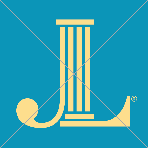
Don’t reproduce in an unapproved color

Don’t rotate or animate the JL

Don’t add special effects such as drop shadows, glows, gradients, or strokes

Don’t distort the shape, the logo should always be proportional
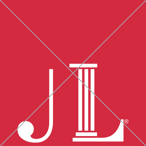
Don’t reconfigure or change the size or placement of any logo elements

Don’t use low-quality or low-resolution logo files
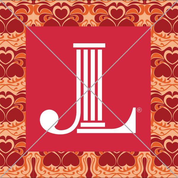
Don’t place against a “busy” background that compromises visibility

CO-BRANDING & MIGRATION

Below are some broad-strokes thoughts on the concepts of co-branding and migration, but please note success often begins with conversation. If you’re interested in either co-branding or migrating and would like to talk about your plans and develop a customized path forward please contact Nicole Bergman (nbergman@ajli.org). She’ll be happy to accompany you on the journey!

CO-BRANDING

In essence, co-branding in our particular case refers to aligning with The Junior League visual identity standards (logo, color scheme, website, and other digital and printed marketing collateral/resources) and ensuring that internal and external messaging reflects the mission, vision, and values of the organization as a whole.
Some relatively simple wins:
  • • JL logo—prominently incorporate the JL logo on your League’s public website homepage
  • • Color scheme—adjust to the JL color palette
  • • Messaging—infuse digital and printed collateral with strong messaging
  • • AJLI info—include information about the Association wherever you have descriptions/definitions about your individual League internally and externally (boilerplates in press releases, newsletters, etc.) so audiences understand the depth and breadth of the organization and its impact.
  • Social media—incorporate JL-branded visual identity elements and messaging into social posts; include affiliation with Association on/in the platform’s “about” page (or descriptor).

MIGRATION

Migration—particularly for a League moving from a unique visual identity to the JL visual identity—is a process that takes time, involves a number of moving parts and requires the right mix of people, planning, investment and commitment. Migration should be executed strategically and with the support of the League’s human and financial capital.
Some things to consider to ensure a successful transition:
  1. Establish a cross-functional team that will oversee the migration for 12-24 months.
  2. Identify the synergies between the two entities and the ways migration creates value for all constituents involved (making the case).
  3. Secure board support (getting buy-in).
  4. Audit League materials for language and visual elements to ensure you have a comprehensive list to include in the migration plan; prioritize most critical to least (including but not limited to program logos, website, email signatures, business cards, letterhead, all envelopes, invoices, PowerPoint templates, social media profiles, signage, nametags, merchandise, co-branded partnership materials, etc.)
  5. Architect a migration plan that outlines roles and responsibilities of key players over the course of the next 12-24 months.
  6. Communicate…communicate…communicate! Make sure key internal and external constituents understand the value of the migration.
  7. Manage the migration over time.

TRADEMARK

A TRADEMARK THAT REFLECTS OUR PRIDE, COMMITMENT AND HERITAGE.

Our brand is a valuable asset, and therefore its trademark must be protected. Our trademark is registered and should be displayed with the appropriate symbol.
In print, the registration mark ® should be properly noted the first time the name is used in a document, like a press release or article, or anywhere else our trademark and copyright notice appears.

Here’s how to indicate our trademark in writing:
Include the ® symbol in the upper right-hand corner, above the word:
  • The Junior League®
  • The Association of Junior Leagues International®
  • Junior League of Name®
The JL icon should always have the ®. There are times when using the icon at a smaller size will make the ® symbol illegible, and therefore may be removed.

ACKNOWLEDGEMENTS

THE POWER OF ASSOCIATION: STRENGTH IN NUMBERS

Our overarching goal is to have greater brand awareness for The Junior League and every individual League that is a part of our Association. It is important to acknowledge that each of us comprise a much larger whole.
We strongly encourage you to have a page on your public-facing website about your League’s membership in The Association of Junior Leagues International. It strengthens your League to show that you are part of an international organization—over 295 Leagues strong. While your work locally is extraordinarily important, there is equal value to communicating that your League is a vital part of a global entity.

ANNIVERSARIES

CELEBRATE SIGNIFICANT MILESTONES IN THE HISTORY OF YOUR LEAGUE.

Association Anniversary
Celebrating your anniversary as a Member of The Association is based on the year your League was admitted to The Association.
ASSOCIATION ANNIVERSARY OPTION 1
ASSOCIATION ANNIVERSARY OPTION 2
Community Anniversary
Celebrating your anniversary within your community at major milestones (20, 30, 40 years…).
COMMUNITY ANNIVERSARY OPTION 1
COMMUNITY ANNIVERSARY OPTION 2

PARTNERSHIPS

CREATING CHANGE THROUGH COLLABORATION.

When your Junior League works with an external organization it’s considered a “co-branded” initiative. This is a partnership between your League and the community organization that can result in increased awareness of both organizations and provide effective marketing opportunities for your League. Co–branding also has the potential to elevate The Junior League brand in the mind of your community.

Logo Placement

Your League’s logo should be equal in size and prominence with equal partner logos. The logo should not be altered in any way. Always maintain clear space minimums around the logo.

ENDORSEMENTS

LENDING CREDIBILITY WITH OUR NAME.

Use of The Junior League brand in conjunction with an initiative, service or event conveys a promise of authenticity and a reassurance of intent. The Junior League brand is the source of credibility and accountability, and the presence of it as an endorsement in the brand name establishes a powerful sense of trust.

Brand Positioning

All programs, initiatives, efforts and events that are produced by Leagues should use a phrase that identifies it as effort “of the Junior League of [city name].”
This phrasing should be should be placed below the mark that represents that initiative, and should be scaled slightly smaller to show hierarchy. Maintain enough clear space between the two for legibility.
The Junior League logo always should be present but depending on product/delivery/collateral may not be able to be locked up with event logo. Make every effort to make sure it’s in close proximity, otherwise you lose the connection between the event and the League.
Jr JL of Ogden
JL St Louis Home Design Tour